
Travel Buddy
Travel Buddy is a concept app designed to make travel itinerary creation simpler. Planing a trip can be overwhelming, especially in big groups. Travel Buddy makes the process more collaborative for people who enjoy planning, and those who procrastinate.
The Problem
A common complaint from friends and family is how overwhelming it is to plan a trip. Researching places to visit, making reservations and creating an itinerary may feel more like task rather than a fun activity. Traveling with a big adds to the problem, as it becomes challenging to make decisions. Thus, our team saw an opportunity to solve a common problem.
How might we make travel planning fun and engaging?
User Pain Points
Responsibility of planning is unevenly distributed.
Difficulty making decisions as a group.
Lack of travel apps for creating itineraries.
Value propositions
Combine various functions with minimal user friction.
Facilitate collaboration
Aid the users in making decisions
Design Process
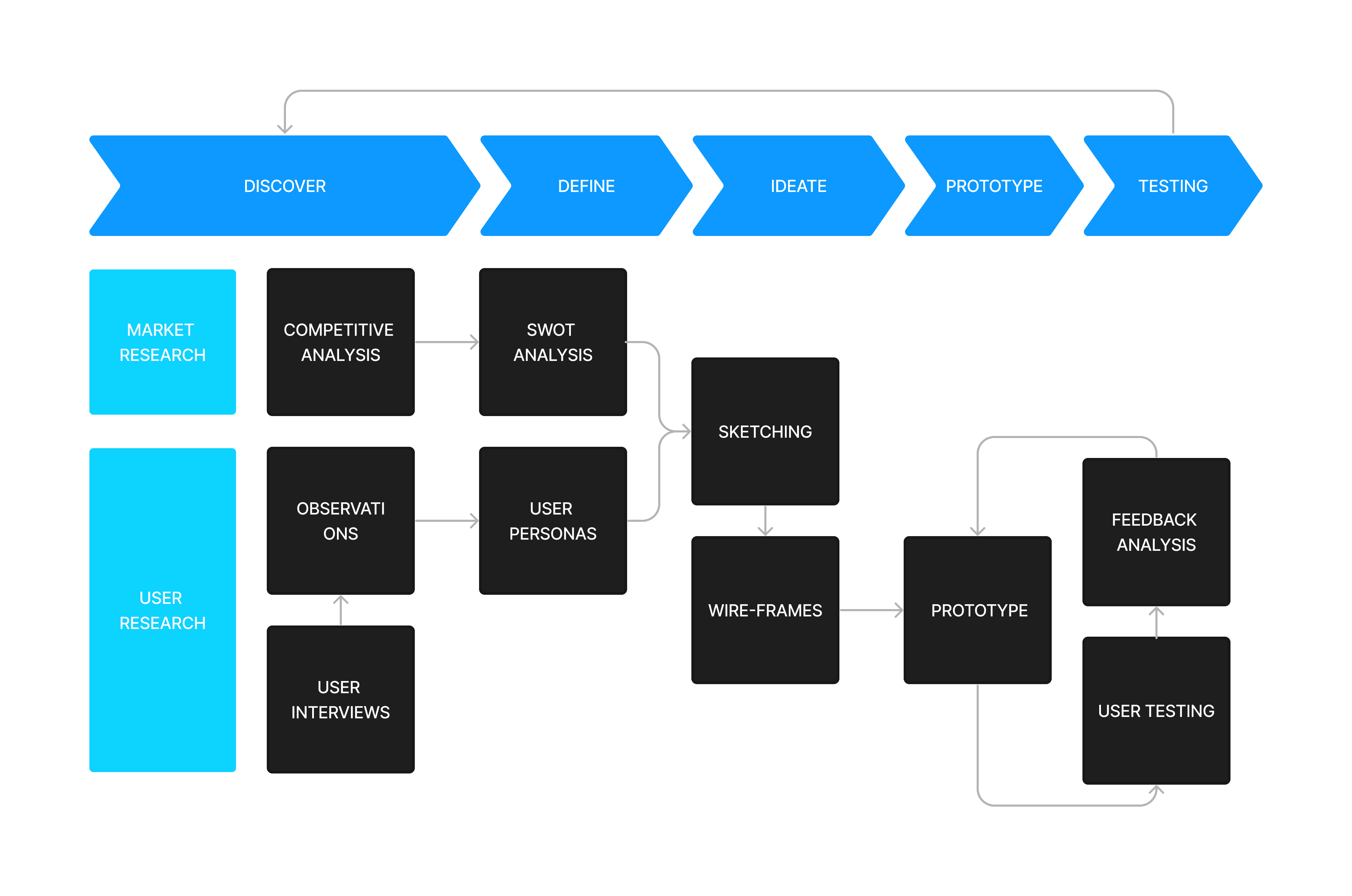
The design process consisted in identifying well established assumptions, exploring new insights through user research, and looking at the problem from a different perspective to create a unique solution.
Qualitative Research
Our first step was choosing the right research methods. Most qualitative research would require a large number of participants to get any significant insights. Due to time constraints, our team decided to focus our efforts on qualitative research. We interviewed 10 different users to gain their unique perspectives on travel planning.
Key Interview Questions
Do you enjoy Planning trips? Why or why not?
What is the first thing you do when you start planning?
How do you sort ideas for your itinerary?
What features do you consider most important?
Key Interview Insights
People either love or hate to plan.
Some people do all the hard work when it comes to planning.
Some people don't plan enough due to a lack of ideas.
People experience "Choice overload"
Competitive Analysis
To help identify assumptions, we looked at apps or websites with a similar purpose. Our method involved gathering reviews from users to track common pain points.
Key Findings
There are too few app options.
Websites focus too much on bookings rather than itinerary creation.
Many sites are tedious, requesting a lot of filling information
User Archetypes
During the interview sessions, we discovered that users fell into a spectrum. One side being the planners and the other side non-planners. We created a user persona for each end of the spectrum. The user archetypes helped to orient the team in the same directionwhen thinking about the users we would design for.

Jack - The Procrastinator
"I like to go with the flow"
Is in his early 20's, and usually travels alone or with friends.
Doesn't need a plan and is spontaneous.
Is not concerned with the details.
Struggles to get ideas an itinerary.

Annie - The planner
"I'm detail oriented"
Is in her mid 30's and travels with her partner or her family.
Often carries the responsibility of planning.
Must follow a schedule and plans every detail.
Makes bookings far in advance.
Information Architecture
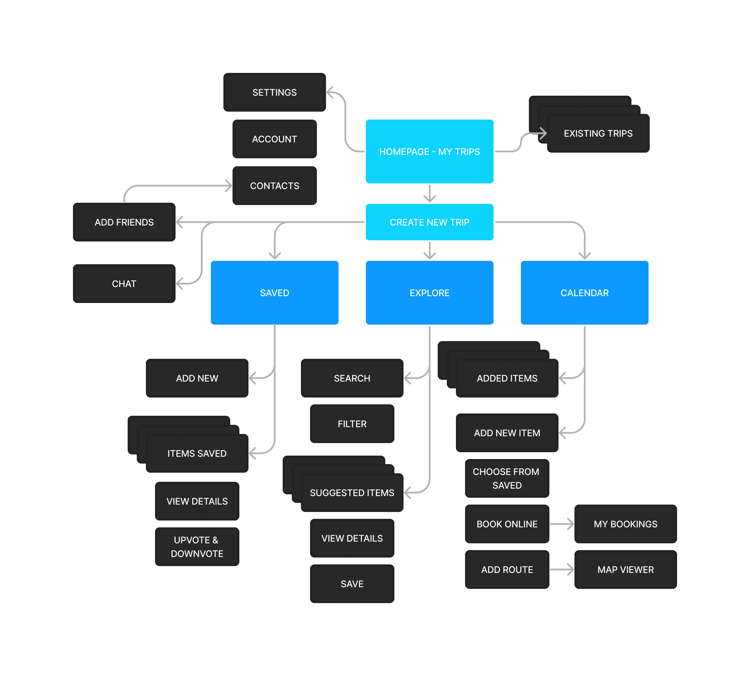
After conducting some initial interviews, we realized the main challenge was designing the information architecture. Planning a trip can be complex, so an app would require many steps. We realized that the success of this concept depended on making the navigation system intuitive. We resorted back to our users to help us guide our decitions.
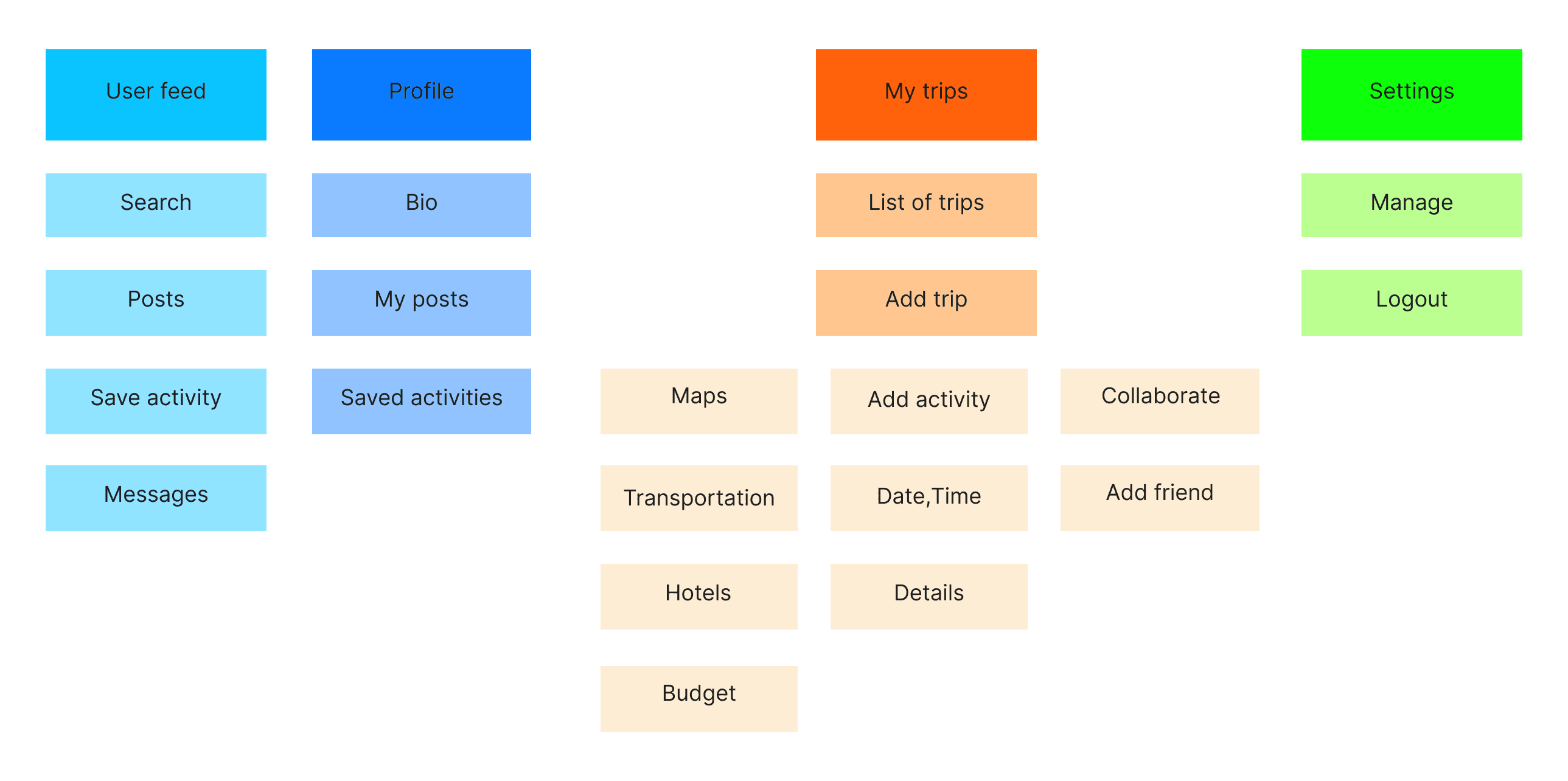
Card Sorting
Users were asked to make groups cards containing various feature names in a way that made sense to them.
Taxonomies
We also asked the users to sort the cards from most relevant to least relevant. We mapped the taxonomies based on the overall results.
Ideation
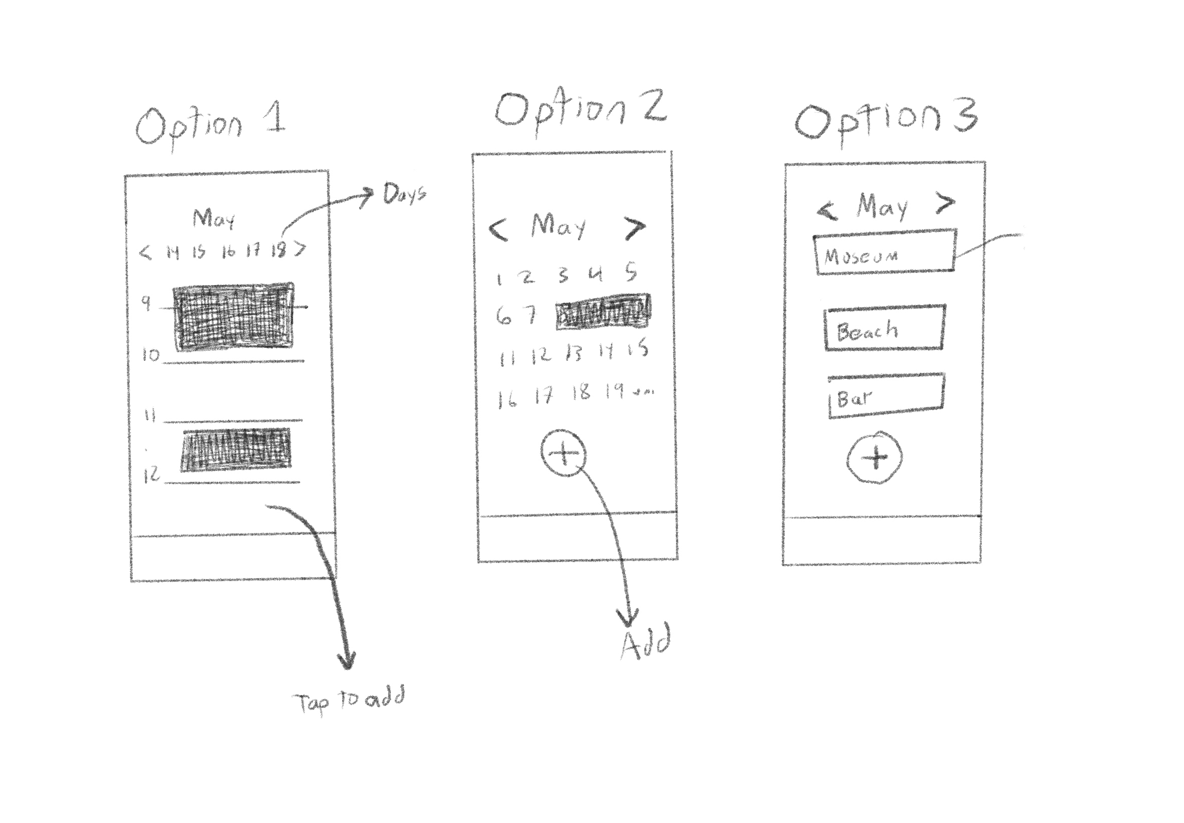
After designing the information architecture, we had a relatively clear vision of what the main features should entail. Rather than conducting a Brainstorming session, we started making sketches for each of the main features.
Sketch of main Features
Users were asked to make groups cards containing various feature names in a way that made sense to them.
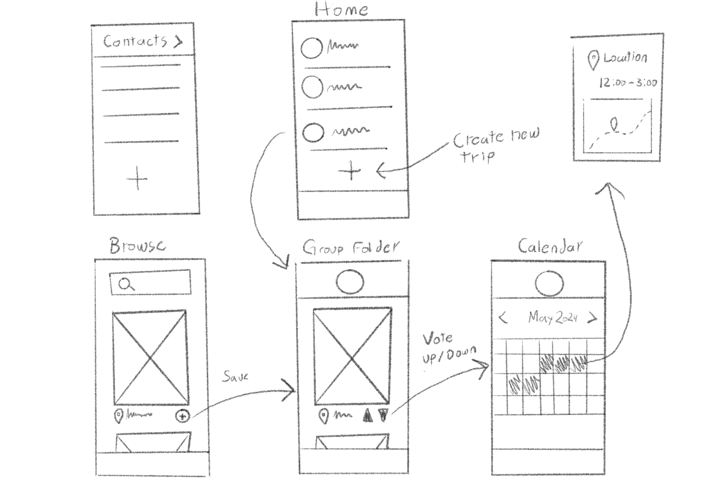
Sketch of Calendar Feature
We also asked the users to sort the cards from most relevant to least relevant. We mapped the taxonomies based on the overall results.

Testing and Refinements
Testing was the most critical step thus far. After creating an initial prototype, we tested our concept with 5 users. According to Nielsen and Landauer's model, 100% of usability problems can be detected by performing studies with 15 users. To achieve 85% detectability through testing with users, you only need 5 respondents. Due to time constraints an project deadlines, 5 users was an adequate enough number.
Behavioural and Attitudinal Analysis
ll 5 users took the test in person. They were simply asked to explore the app without guidance. They were also asked for their thoughts an feedback on specific Painpoints.
Feedback Analysis
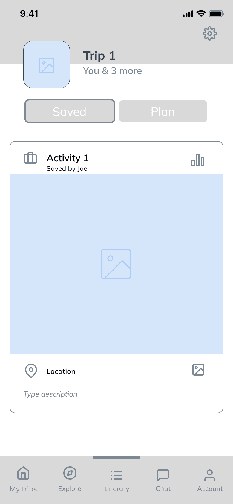
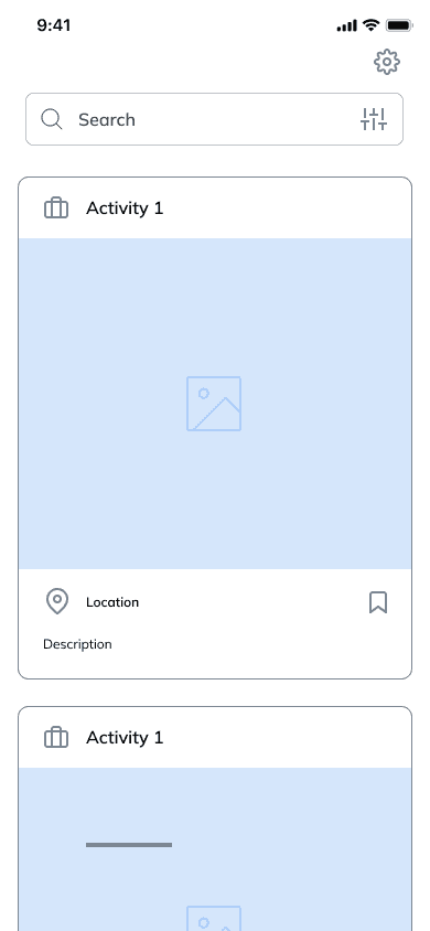
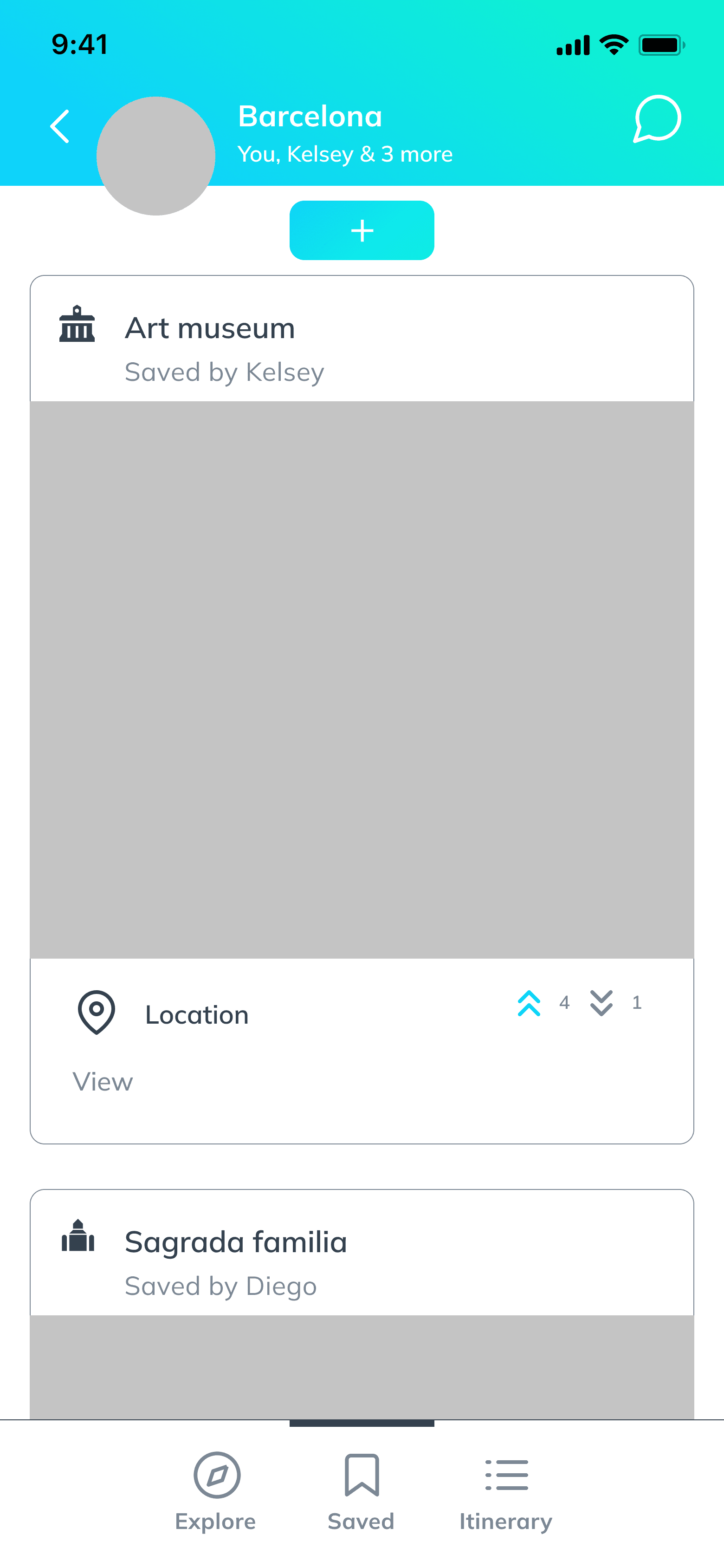
We noticed that the users were confused between the "Saved and "Plan" features. To resolve this issue, we changed labeling and simplified the navigation.
Before User Test
After User Test
Final Prototype
The final prototype is a more simplified version to some existing services. The focus is not on budgeting or account management but rather offering guidance and goal setting, two major needs that users expressed throughout the development of the project. Overall, the functionality of the app into two main processes.
1
Browsing Activities
Through our research we realized some of the main user struggles were not having enough ideas for an itinerary, or not being able to choose which ones.
We incorporated "Explore" and "Saved" features to facilitate browsing. Users can then upvote or downvote activities shared in the group by other members.
2
Making an Itinerary
The third feature is the itinerary creator, where users can input their chosen activities into a calendar. The feature works similarly to any calendar app. Once the users had created a list of ideas for their itinerary, they can add them from the "Saved" folder into the calendar.
Lessons Learned
As a conceptual piece of work, this project continues to evolve and incorporate better features. Overall, our team was successful a building a tool for itinerary creation that encourages users to plan trips man make decisions in big groups. Out of 15 participant who tested the final product, 15 found the app to be useful and would consider using it.
Less is More
One of the original goals for this project was to incorporate multiple features in one app. However, during our testing process we learned that the more features, the more the users became confused. Our team decided to focus primarily on itinerary creation as an overarching feature.
Account for User Learning Curves
Every user has a learning curve when using a feature for the same time. During our testing process, we realized that testing the same user before and after making refinements was ineffective, as they would already fe familiar with the concept. We aimed to capture the user’s learning curve by always showing new versions of the app to new users.